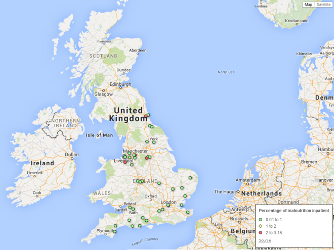
More than 3,000 malnutrition inpatients in 46 NHS foundation trusts in 2014; how to manage the health conditions of inpatients?

DSC_0537 (2) There were 3,324 malnourished inpatients in NHS hospitals managed by 46 foundation trusts in 2014. Figures have been increasing due to the increase of inpatients since 2011, and more than 40% of malnourished inpatients were in Gateshead NHS foundation trust. Figures were obtained by FOI requests from 46 trusts in England. 

In 2013, the average percentage of malnourished inpatients in 46 trusts was below 0.1%, and it had slightly increased from 2011. The proportion of malnutrition inpatients was lower than 1% in 43 trusts in 2013, but have increased in 25 trusts in comparison with the previous year.

Total number of 46 NHS foundation trusts

Year Average percentage of malnourished inpatients Total number of malnourished inpatients Total number of inpatients
2011 0.07 2,627 3,554,409
2012 0.08 2,813 3,612,338
2013 0.08 3,102 3,710,775
2014 3,324

In three trusts, the percentage of malnourished inpatients was over 2% in 2013, and highest in Gateshead Health NHS foundation trust at 2.19%.
Capture
How many malnutrition inpatients in your local NHS foundation trusts?

Trusts with the highest percentage o malnourished patients in 2013

NHS foundation trust Percentage of malnourished inpatients Number of malnourished inpatients Number of inpatients
Gateshead Health NHS Foundation Trust 2.18 1,310 59,970
Cheshire and Wirral Partnership NHS Foundation Trust 2.15 55 2,559
Sheffield Health & Social Care NHS Foundation Trust 2.01 20 993
Yeovil District Hospital NHS Foundation Trust 0.42 169 40,265
Salford Royal NHS Foundation Trust 0.18 147 80,856

an aging POPULATION AND MENTAL PROBLEMs POSSIBLY AFFECT THE NUMBER OF MALNourished INPATIENTS

Are there any particular reasons why trusts have many malnourished inpatients? Kerri James, communications officer of QE Gateshead said;

“At the Queen Elizabeth Hospital we have two older person’s mental health inpatient wards and also two general older persons ward. Malnutrition is something that generally occurs in an older population, and as a lot of our inpatients fall into this category. It’s natural that would be reflected in a higher number”.

“Many patients come into hospital already malnourished which would need to be taken into account for these figures”.

“People with mental health problems are often at higher risk of malnutrition as they are unable to care for themselves properly at home, so are malnourished when they come to us, we have two older person’s mental health inpatient wards”.

BAPEN (British Association for Parenteral and Enteral Nutrition), released a result of a nutrition screening survey in the UK in 2014. According to the report, the prevalence of malnutrition becomes more likely in elderly people.

In Gateshead, the food budget has been increasing since 2012, and inpatients are served a meal three times daily (breakfast, lunch and tea) plus snacks for the last five years.

Year Percentage of malnourished inpatients Number of malnourished inpatients Number of inpatients Annual budget for foods for inpatients(£)
2010 2.04 970 47,596
2011 1.85 1,071 57,903 647,506
2012 1.80 1,033 57,462 598,155
2013 2.18 1,310 59,970 758,188
2014 1,362 767,868

Also, Jane Harris, communications manager of Sheffield Health & Social Care NHS Foundation Trust, explains their situation;

“We are a mental health and social care Trust. Therefore, the patients admitted into our hospitals and in-patient services are people who are experiencing a significant deterioration in their mental health and well-being or who have been diagnosed with dementia or who have a learning disability”.

“The nature of their illnesses or diagnosis may mean that they have not been regularly eating and/or drinking prior to admission”.

Food education is more important to improve the nutritional health of inpatients

According to the UK government, the average food cost per inpatient per day was £10.48 in 2013, this had increased by £0.61 from the previous year. However, the average percentage of malnourished inpatients had not decreased.

Nigel Penny, Senior Lecturer in Applied Nutrition and Physiology at Birmingham City University, said that food costs do not necessarily influence the number of malnourished inpatients.

“The catering provisions used to be outsourced. The reason of malnutrition of inpatients is more about education about what is a balanced and healthy meal”.

“Nutrition specialists should be involved with choosing the right foods for each inpatient. In the long term, choosing the right foods can prevent illnesses and reduce the costs of the NHS”.

Foundation trusts in the UK have financial problems. 77 NHS foundation trusts of 152 in England are in deficit, and the overall net deficit was £349 million in 2014, the latest statistics of the UK government have shown.

In 2013, the surplus was £126 million, and the financial situation is rapidly declining from the previous year.

how to manage the nutritious conditions of inpatients properly?

In this situation, the Queen Elizabeth Hospital focuses on care for the elderly by using a picture menu. James said;

“We have lots of initiatives such as easy to use crockery and drinks containers, and also patients who need extra help at mealtimes and with drinking are giving red crockery so that anyone involved in their care knows”.

“Our catering department has also a created a picture menu to aid with keeping people well fed, as research found people, particularly with mental health problems like dementia, responded much better to a pictorial menu”.

Harris also explained the efforts by Sheffield Health & Social Care NHS Foundation Trust;

“We have introduced an electronic based version of the malnutrition universal screening tool (MUST) and associated training is in place across most of the in-patient areas and we have reviewed our weight management care pathway during the past year”.

“We have improved the quality of diet available and the experience of dining within residential services. Advice on diet is being made readily available including improved methods for measuring and recording hydration of vulnerable individuals”.
More than 3,000 malnutrition inpatients in 46 NHS foundation trusts in 2014; how to manage the health conditions of inpatients?

Many knowledge on data journalism shared at media conference in US

IRE, a non-profit organization for investigative reporting, has a program called “NICAR“. NICAR particularly focuses on data journalism, and held a media conference in 5-8 march in Atlanta. Many knowledge of data journalism were shared during this term. An interview article and many presentation materials are still available in the internet.

Eva Constantaras, an American investigative data journalist, talked about her experiences and opinions on data journalism.

Mar Cabra, an editor of ICIJ, explained the method of data driven investigative journalism. She introduced a case on tax dodge of the major multinational companies, and explained how ICIJ obtain the material data on the incident.

Michael Corey, senior news applications developer for Reveal, talked about his project to detect environmental dangers in the US by analysing data.

Some people referred to technical aspects. Tisha Thompson introduced typical coding skills for data journalism. She also referred to R, a free software for data analysis.

Natalia Mazotte, introduced some online tools for data visualisation such as Timeline.js, Odyssey.js, Datawrapper, etc.

You can find materials here, and find more information on Twitter by searching with the hushtag #NICAR15.

Many knowledge on data journalism shared at media conference in US

9 useful tools for data analysis and visualisation

There are many useful tools to make data visualisation articles. I picked up some major tools as follows.

These kinds of tools emerge year by year. In this situation, we should not stick to particular tools, it is much more important to understand basic concepts of data analysis and visualisation, and utilise tools as necessity.

Spreadsheet

1. Microsoft Excel

Perhaps Microsoft Excel is a most famous spreadsheet, and many journalists seem to be familiar with this software. Excel provides so many useful functions for data analysis and visualisation such as sort, extract, data scraping, etc. This software seems to be one of the most basic tools for data journalism.

Data cleaning

2. OpenRefine

OpenRefine is a high performance data cleaning and transformation tool. This tool has many functions not only data extraction, but also geocoding.

Making chart and map

3. infogr.am

Users can create a colourful and bustling charts and simple infographics by using infogram. This tool is good to create simple charts, but it seems to be unsuitable to make charts have many figures because of its narrow interface.

4. Google Fusion Tables

Google Fusion Tables is a representative online data mapping tool, and many data journalism contents are based on this tool. Users can also create a graphs and charts. Many learning resources are available in the internet.

5. CartoDB

CartoDB is a high performance data mapping tool. This tool detects a location of figures from postcode automatically. This tool is also useful for decorating maps by using various kinds of design templates. Users can create 5 data maps for free.

Converting data

6. Nitro

Some data sets are provided by PDF format only, so converting huge volume of data by manual input seems to be a formidable task. Nitro can convert PDF data to xml format.

7. Batch geocoding

Latitude and longitude are important information to specify locations of data, but some data provides postcode only. We can convert postcode to latitude and longitude by using Bath geocoding.

Other

8. Tableizer

Users can convert data on spreadsheet to HTML tables by using Tableizer.

9. R

R is an amazing tool for statistical analysis. Many software products for statistical analysis like SPSS are expensive. In contrast, R is open-source and completely free, and many learning resources are available on YouTube.

9 useful tools for data analysis and visualisation

4 good pieces of data journalism and infographic on medical issues

It seems that one of the most important things for studying journalism is finding and analysing superior pieces. I’m particularly interested in medical issues, and picked up 4 good pieces of this genre. Some pieces are good examples of investigative journalism, and the other pieces used charts and interactive component effectively.

1. Methadone and the politics of pain

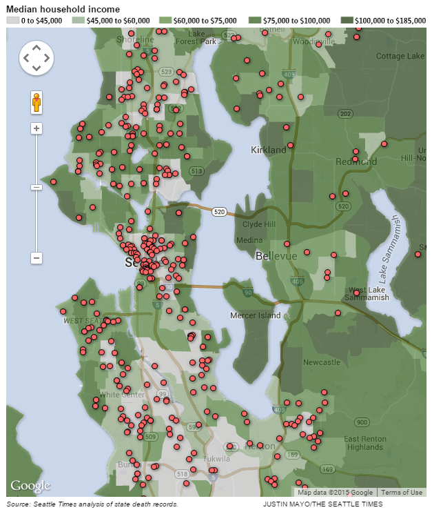
The Seattle Timesmethadone series are famous as great examples of data-driven investigative journalism. These pieces described a drug disaster of methadone, a cheap and powerful painkiller. The Washington state used this medicine to save the medical costs, and The Seattle Times analysed the relationship between consumption of methadone and deaths of residents, and got a Pulitzer award in 2012. They analysed plenty of datasets and documents, and also interviewed many concerned people.

Untitled
The Seattle Times’ data map showing the deaths occur in low-income areas.

They used many charts and data maps to describe this incident effectively. Also, they provided many good interviews. This is a good combination of quantitative and qualitative approach.

2. Even After Doctors Are Sanctioned or Arrested, Medicare Keeps Paying

This article is also a good piece of investigative journalism by using a plenty of data. ProPublica, a non-profit newsroom in the US described that some of the physicians in the US received payments from Medicare with fraud. This article provides much supporting data and documents, readers can see the databases by clicking each link.

I think it is also a brilliant piece, but personally think it is better to provide more visual elements such as data map or chart. They will help readers to understand this story more concisely.

3. A visual guide to the Ebola virus epidemic

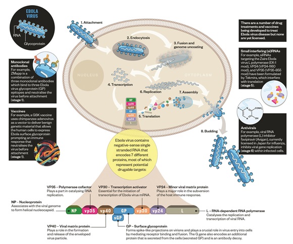
Dawn Connelly, an editor at The Pharmaceutical Journal, described the epidemic of Ebola virus in 2014 by using charts and infographics, and won the Data Journalism Award at the Medical Journalists’ Association winter awards in 2015. This piece explained an outbreak of Ebola virus, and a process; how Ebola virus infects people, and compared the public health infrastructure between the UK with African countries. I think it is a good example of utilising visual elements.

1067467_biology-of-the-ebola-virus-14
The Pharmaceutical Journal released an illustration of Ebola virus.

4. A&E tracker, 2014-15

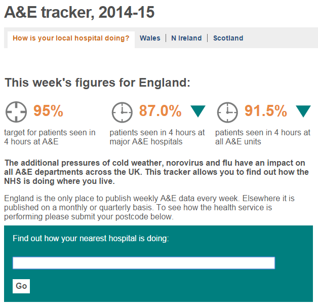
The BBC produced an excellent interactive database showing the corresponding situation of A&E such as response times, cancellation on operations, etc. Readers can find data of each hospital by inputting postcodes.

Untitled
BBC’s A&E tracker

Producing interactive content seems to be effective to engage readers. This kind of content motivates us to learn coding skills more actively.

4 good pieces of data journalism and infographic on medical issues